Monogram Use


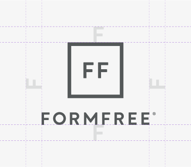
Just like our primary logo, every version of the monogram needs enough negative space around it to ensure it always displays well.
Area of Exclusion
As a rule of thumb, the letter “F” (at the size it appears within the square outline of the monogram) can be used to determine whether or not the monogram has enough clearance. The letter “F” as it’s sized in the wordmark for the vertical and stacked monograms isn’t sufficient.
The area of exclusion should not contain any other design elements.
Color Variations and Sizing
Just like our primary logo, our monogram can appear as a white knockout or in our signature off-black. The same color guidelines applied to our full logo in the Logo Use section of this guide also apply to the monoram.
- In digital applications, our monogram should appear no smaller than 31px wide. It should be at least .5 inches in print.
- In digital applications, our stacked monogram should appear no smaller than 45px wide. It should be at least .75 inches in print.
- In digital applications, our vertical monogram should appear no smaller than 65px wide. It should be at least 1 inch wide in print.
- In print applications,
Use Cases
As mentioned before, the monogram lockups are secondary options for situations where our primary logo isn’t appropriate. Some of those scenarios include:
- Apparel or promotional merchandise where the wordmark doesn’t capture enough attention.
- Situations where a logo needs to appear in a tiny area that the primary logo sizing guidelines don’t allow.
- App icons, favicons, or applications where a graphic mark is the only suitable option.
- Supplemental placements where our primary logo has already appeared.
- Uses that are purely internal, and there’s no possibility of external visibility.