Introduction
This brand guide will equip you with the resources you need to represent FormFree in the wild. What you’re doing is part of our greater mission, so we want to make sure you have everything you need!
Whatever your reasons for showcasing the FormFree brand, know that you’re going to be part of helping lenders and borrowers arrive at their end goal sooner. That’s a big deal, and we’re excited that you’re a part of it.
Our Mission
FormFree is leading a digital revolution in automated asset, income, and employment verification to make lending simpler, safer, and faster than ever before.
Our long-term vision is to demystify every dimension of a borrower’s “Financial DNA.” By that, we mean their asset, employment, income, credit, identity, and liens-and-judgments data.
By making that information portable and safe to easily share between consumers and the financial partners they do business with, we’re democratizing the credit decisioning process. The changes we’re making are bringing about a better future for everyone.
Brand Essence
For the people behind the payment.
What is this?
Our brand essence is our mantra. It’s our reason for being. In a few words, it embodies are mission. We want to create a better, modern homebuying experience for everyone.
Our products free consumers from collecting physical statements and filling redundant forms; removing the worst part of the home-buying process. They empower lenders with accurate credit decisioning data, a more streamlined lending process, and propel them in their careers.
At the end of the day, our work isn’t about the data we verify, it’s about the lives we impact. Our compassion for others informs every customer interaction and guides how we treat one another inside FormFree.
Personality
These traits are the pillars of our brand expression. If FormFree were a person, these would be their most intrinsic qualities.
Sharp
We’re quick with a quip or well-informed answer. Yeah, we’re intelligent (if we say so ourselves) but we’re also focused, savvy, and clever. We’re more than book smart, we’re intuitive.
Brave
The future is bright, and we can blaze the trail to it. What we’re doing takes a visionary mind and an adventurous attitude. We’re thought-leaders and we have the know-how to make the world better.
Noble
We’re here to improve lives and empower people. If you can’t sense it by now, FormFree is fueled by passion, and our interest in helping others is genuine.
Friendly
We do serious work, but we’re never stuffy. We make cumbersome processes easy-breezy, and we have a good time doing it.
Voice and Tone
Any time we create content for the public, it’s an opportunity to express our brand’s personality. We’ve always forged our own path, and that’s the approach we should take when it comes to content generation.
Let’s do our own thing and use a voice that’s unique to us.
Our Voice
As people, we all have our own personalities and they each come out in the way we communicate. For our brand’s written content, we refer to that as our voice.
In the same way that your personality never truly changes, our brand voice is always consistent.
We are conversational.
When we’re writing for our brand, it’s always worth taking a minute to read that content out loud. Sometimes technical writing needs to be crafted a certain way, but everything else should sound like it came from someone’s mouth.
We are clever.
We’re intelligent and wity. We have the right answers to any question, and recognize the right opportunity to make people laugh. We never want to be rude, but we’re brave enough to be funny.
We are empowering.
We always have one eye on the prize: our mission is to empower consumers and lenders with direct-source credit decisioning data. We want to stay focused on the benefits we deliver and how our data helps people achieve great things.
We’re straight-forward.
One of the biggest obstacles we have is how people think adopting our products is hard. If our wording is complicated or overly fluffy, it suggests our user experience is, too. So, keep it simple and get right to the point!

Our Tone
While our brand voice is always the same, our tone can change depending upon who we’re taking to.
Think of it this way: you wouldn’t speak to a close friend in the same way you’d speak to your boss. That is the difference in tone we’re talking about.
For Executives and Managers
This audience is ambitious, analytical, hard-working, results-driven, and focused on how FormFree can help their organization.
- Present quantifiable results.
- Show how we’ve helped similar clients.
- Outline benefits concisely.
- Show how we’ve helped similar clients
For Top Producers and Loan Officers
Regimented, competitive, and sometimes stubborn, this audience is focused on their career and controlling everything that goes into their loans.
- Explain this will close more loans.
- Show how we offer a competitive edge.
- Show how this improves the borrower experience.
- Show how we reduce time-to-close.
- Explain how we eliminate the paper chase of manual verification
For borrowers and other consumers
All these people want to do is enjoy their new home, skip through the work involved in collecting forms, and live their lives.
- Keep it simple.
- Offer them a helping hand.
- Let them know we’re here to help.
- Talk them through progress.
- Touch on security when appropriate.
Our Logo
Our logo is our brand’s signature and it’s our most integral brand element. Treating it with respect is key to making sure our presentation speaks to the quality of our products and service.
Our logo is clean, minimal, and confident. When it comes to lending, our entire mission is to get rid of the hoops, challenges, and obstacles that get in the way of our customers’ professional and personal lives. The FormFree logo’s design is a reflection of that freedom.
Logo Use

We always want to make sure that our logo has enough negative space around it to ensure it’s treated respectfully and other design elements aren’t confused as being part of our logo.
Area of Exclusion
As a rule of thumb, the letter “F” (at the size it appears within the logo being sized) can be used to determine whether or not the logo has enough clearance. This area of exclusion surrounding the logo should be free of all other design elements.


Color Variations
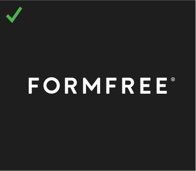
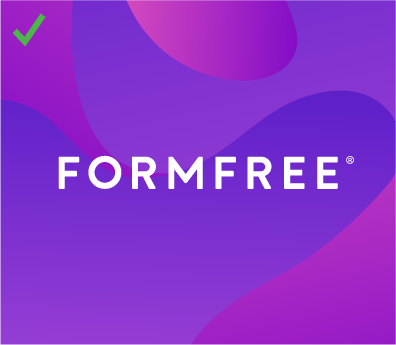
The color configurations shown above are the only approved variations of our full logo. The white background version (shown above over a light gray for contrast) is our preferred version, however, we have three other options:
- Aside from our official FormFree Gray, we occasionally use a particular shade of off-black in our brand. When a creative application calls for it, our logo can appear over this color as a knockout.
- Our brand uses a variety of formless shapes (called Forms) that appear in our layouts. As long as a Form is sized in a way where it does not interfere with the legibility of our logo, our logotype can appear over top of it as a knockout.
- While it is an application we want to use very sparingly, our logo can appear over our signature purple as a knockout.
Sizing
In digital applications, our logo should never be smaller than 140px wide, or 1.25 inches in print.
Logo Misuse
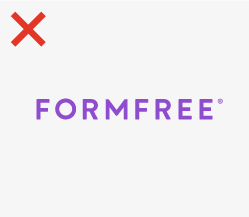
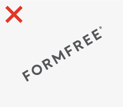

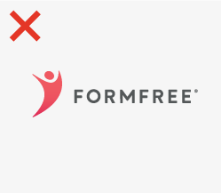
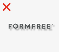

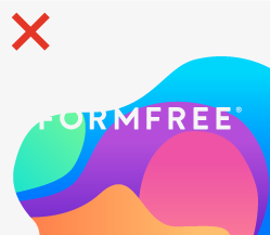
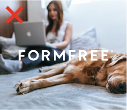
The diagrams above are showing common examples of improper logo use. These examples are not acceptable and they degrade the visual integrity of our brand.
- Do not use another color for our logo other than those shown in the Logo Use section of our guide, even if that color is part of our brand system (Figure o1).
- Do not tilt or rotate our logo so that it isn’t in a normal, horizontal orientation (Figure 02).
- Do not stretch or distort our logo so that it uses incorrect proportions (Figure 03).
- Do not pair our logo with our legacy brand mark. Mickey is dead, long live Mickey (Figure 04).
- Do not apply special effects to our logotype, including drop shadows, lens flares, and glow effects (Figure 05).
- Do not apply gradients to our logotype or mask one of our Forms within the type itself (Figure 06).
- Do not place a Form behind our logo in a way where its shapes disrupt the legibility of our type. Don’t allow our logo knockout to pass outside of the boundaries of a Form onto white (Figure 07).
- Do not place our logo over a photo without ensuring its legibility (Figure 08).
- Do not use our logo in a way where the quality or resolution of the file isn’t appropriate for the application (Figure 09).
Our Monogram
Our monogram is a secondary graphic mark that supports our primary logo in situations where a wordmark wont display well on its own.

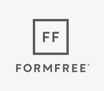

When we need a logo to represent the FormFree brand and space is limited, our wordmark is what we rely on. Our wordmark should always be our go-to selection, but the monogram is our “plan b.”
We have three versions of the monogram:
- “Monogram” is the name we use to describe the double-F’s enclosed within the outline container.
- The Vertical Monogram is when this mark appears center over the FormFree wordmark. In this option, our wordmark is a bit larger than the monogram.
- The Stacked Monogram is when our monogram appears centered over the FormFree wormark and both elements are the same width.
Monogram Use

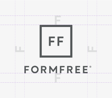

Just like our primary logo, every version of the monogram needs enough negative space around it to ensure it always displays well.
Area of Exclusion
As a rule of thumb, the letter “F” (at the size it appears within the square outline of the monogram) can be used to determine whether or not the monogram has enough clearance. The letter “F” as it’s sized in the wordmark for the vertical and stacked monograms isn’t sufficient.
The area of exclusion should not contain any other design elements.
Color Variations and Sizing
Just like our primary logo, our monogram can appear as a white knockout or in our signature off-black. The same color guidelines applied to our full logo in the Logo Use section of this guide also apply to the monoram.
- In digital applications, our monogram should appear no smaller than 31px wide. It should be at least .5 inches in print.
- In digital applications, our stacked monogram should appear no smaller than 45px wide. It should be at least .75 inches in print.
- In digital applications, our vertical monogram should appear no smaller than 65px wide. It should be at least 1 inch wide in print.
- In print applications,
Use Cases
As mentioned before, the monogram lockups are secondary options for situations where our primary logo isn’t appropriate. Some of those scenarios include:
- Apparel or promotional merchandise where the wordmark doesn’t capture enough attention.
- Situations where a logo needs to appear in a tiny area that the primary logo sizing guidelines don’t allow.
- App icons, favicons, or applications where a graphic mark is the only suitable option.
- Supplemental placements where our primary logo has already appeared.
- Uses that are purely internal, and there’s no possibility of external visibility.
Monogram Misuse
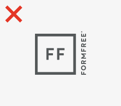
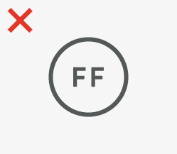

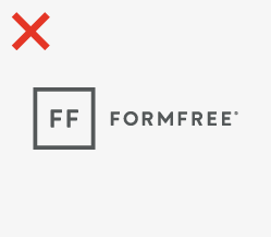
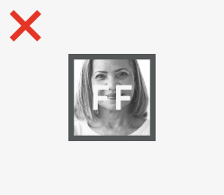

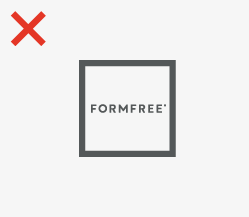
All of the guidelines featured in the Logo Misuse section also apply to our monogram. Additionally, the diagrams above show unacceptable applications that are specific to this set of logos.
- Do not create new monogram versions by changing the way the graphic mark locks up to our wordmark (Figure 10).
- Do not change the shape that the double Fs are enclosed in (Figure 11).
- Do not stretch, distort, or adjust the monogram. Also, do not adjust the proportions of the enclosure, the type within, or the relationship between those elements (Figure 12).
- Do not create a new logo by combining our monogram and wordmark in new ways (Figure 13).
- Do not use the monogram’s enclosure to mask images. Do not place the monogram over an image in a way where it makes our logo challenging to identify (Figure 14).
- Do not use an unapproved color for our monogram (even if that color is within our system). Do not change the color of the letterforms without also changing the color of the enclosure. (Figure 15).
- Do not replace the double Fs for the primary logo (Figure 16).
Typography
Our brand has a typographic palette that is meant to both provide us with the versatility needed to do anything, but the constraints we want to make sure we are always consistent. Only use the typefaces identified in this section for branded content and make sure to implement them within these specifications.
Work Sans Light is the typeface that we use for most of our content. Its light weight allows our body copy to appear light, open, and effortless.
In situations where Work Sans Light doesn’t offer enough contrast to be legible (for instance, in print applications using a background color), it’s permissible to use Work Sans Regular instead.
Work Sans Regular is the typeface that we use for content that requires added emphasis. It is, of course, a heavier weight but not yet bold enough to be distracting.
Work Sans Regular is best used for subheads, headlines that need a more subdued treatment, and portions of text that need to stand out from surrounding content that is set in Work Sans Light.
Work Sans Bold is the typeface that we use for headlines. It’s a heavy enough weight to command attention, but isn’t so bold that it takes away the sophisticated qualities of our presentation.
Work Sans SemiBold should be our go-to font for headlines, calls to action in advertising and marketing, and any other piece of content that is high priority.
Arial is the web safe font we rely on for very specific applications. It’s the only typeface we use other than Work Sans, and it should only ever be used for:
- Email signatures
- Marketing email content
- Microsoft Office applications
- All other uses where fonts can’t be embedded
Color
Pantone
425 C
| CMYK: | 63 51 45 33 |
| RGB: | 84 88 89 |
| Hex: | #545859 |
Pantone
419 C
| CMYK: | 76 65 66 90 |
| RGB: | 33 35 34 |
| Hex: | #212322 |
Pantone
2083 C
| CMYK: | 51 70 0 0 |
| RGB: | 150 94 199 |
| Hex: | #904CCE |
Social Media
To maintain a cohesive appearance when we post to social media, we have a range of graphic templates for each platform that still provide a range of options (depending upon the post type).
Articles
Posts that link to a blog article, news items, or an editorial segment hosted on a site other than our own can use one of the following templates.
Conferences
For posts that are announcing a conference or event, we have another set of templates. Depending on whether FormFree is in attendance or someone on our team is a key speaker determines which of the following options we use.
Partner Posts
Sometimes we may want to make a post announcing a new partnership, highlighting one of our partners’ achievements, or just talking about our work together. For those situations, we have a few options.
Press Releases
You could say that FormFree is making big moves. When we create a press release, we may want to link to it on social media. In those situations, we have a couple templates that let everyone know what we’re up to.